The user engagement of the Oranj client portal was lower than expected. So a couple of redesign projects are kicked off in 2018 to increase the user engagement. The adviser home dashboard is on the list because it’s the most frequently visited page on our platform. After analyzing the usability issues of the existing product, I found these problems need to be solved:
-
Data density on the home dash was very sparse
-
Data provided to advisers wasn’t useful or well organized
-
No clear understanding what the users should do next
Background


Home Dashboard Redesign
Design Process

2018 • Oranj • Outcome: prototype, interaction design, visual interface, wireframe
Challenges
1. What is the proper data density?
Based on the research, I learnt that financial advisers prefer high data density, they want to glance over the statistics without scrolling on the dashboard. From the competitor analysis (EnvestNet, Personal Capital, Morningstar etc), I found that basically most of the enterprise financial platforms display all the necessary data above the fold, but the column amount varies from 2 to 5. So I sketched 4 different grid layouts:

▲ Image1.1 Data Density Sketches
I finally picked the 3-column layout because of two reasons. First of all, there are only 6-7 widgets need be displayed in our dashboard. Secondly, there is an expandable navigation bar on the left-hand side, too many columns will affect the data readability.

Goals
To improve user engagement and usability, three design goals were made for the adviser home dashboard redesign project:
-
Provide increased data density
-
Organize the data better
-
Guide the users of what actions need to be taken for next step
Design Iterations
2. How to prompt the advisors with the “in-context” actions?
I want the product to be proactive in monitoring processes and providing immediate feedback to the adviser either that there is a next step or there is a new task to be completed. Here are some workflow examples of what the financial advisers need to pay attention to:
A lot of things could go wrong
-
account data is out of date
-
custodian setup is not completed
-
.........
A lot of things need to be engaged
-
client's birthday is coming! time to call him/her
-
several accounts need to be rebalanced
-
several accounts are not assigned to models yet
-
..........
The homepage needs to display these alerts and notify the advisers to take care of them. However, the users could quickly feel annoyed if all the notifications are just stacked on the homepage without showing the value or context. So I need to find a way to only prompt the users with the 'in-context" actions.
3. How to organize the data based on the priority?
Organization of information should be guided by hierarchy of what information is most important to the user. Key information should stand out and be understood clearly and quickly. Here are a couple of questions I asked myself:
-
Where should I place the most important information?
-
How about the secondary supporting information?
-
How do I lay out charts and text to enable consistency and clarity?
-
How can white space help my audience absorb information and tells a clear story?
I started to build the information architecture:

▲ Image1.2 Information Architecture
Based on the existing data and the new column layout, I came up with this wireframe. Compared with the old dashboard, there are several improvements:
-
New data density could provide more content without scrolling
-
Toggle pattern has been simplified and unified
-
Donut chart style has been improved
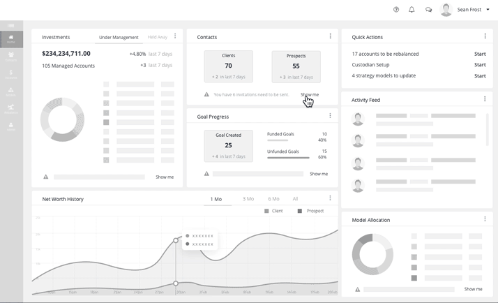
Meanwhile, I also got feedback to improve the usability. First, Some widgets still look sparse, it makes more sense if the related data can be merged into one single widget. Second, there can be a list of work need to be done, so an individual 'to-do list' widget can help the advisers to quickly find these unfinished activities. Third, the notification inside a widget should be a 'Call-to-action' (CTA), so when a user is notified, a button should be next to the notification so the user could take immediate action without going somewhere else. Based on the feedback, I iterated the Information Architecture and the wireframe:

▲ Image1.3 first iteration wireframe

I also defined the user workflows of when the advisers click "show me" buttons. Each button takes the users to the corresponding landing pages. For example, if a 'Call-to-action' says "You have 6 invitations need to be sent", then by clicking the 'Show Me' button, the user will be taken to the mass invite flow which allows the advisers to send the customized invitation emails to multiple clients.

▲ Image1.5 Mass invite flow
▲ Image1.6 Mass invite prototype
Hi-Fi Prototype
▲ Image1.2 Information Architecture
I planned to validate the design assumption with PM by getting the feedback from the users. In order to test the design with enough details, I designed the Hi-Fi prototype with dummy data and visual style.
User Testing
I conducted 5 user testings with the external financial advisers along with PM. They are volunteers from our existing user pool who wanted to try out the new dashboard before the formal release. At the same time, I and PM also run a few simple internal user testings with the employees who used to work as financial advisers.
Overall these participants love the new design. Advisers understood the vast majority of the widgets and the data within. They could identify what was a 'quick action' versus 'activity feed'
There are also a couple of things we learned and changed based on the testing results:
Update 1: Move the 'Quick Actions' widget and the relevant widgets to the first column on the left.

▲ Image1.7 Hi-Fi prototype

▲ Image1.8 user testing update 1
Update 2: Instead of tracking "last 7 days", the financial advisers want to see the performance changes in "last 90 days”.

▲ Image1.9 user testing update 2
Final Design

▲ Image1.10 Final design


▲ Image1.11 Empty Status

▲ Image1.4 second iteration wireframe